


Advise - Need to select new bathroom paint tonight!
piscesgirl
10 years ago
Related Stories
COLORSpeed-Dial Color Selection to Get the Best Result
You’ve belabored your color decisions and are still stuck. Here is how to evaluate your space and make choices that are right for you
Full Story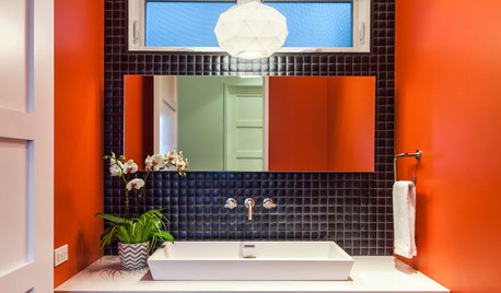
BATHROOM DESIGN7 Striking Paint Colors for Your Powder Room
Whether you opt for a little or a lot, see why the petite bathroom is the perfect place for a fun hue
Full Story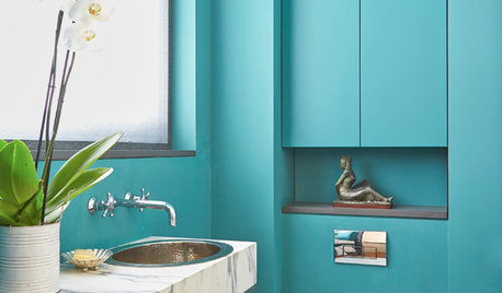
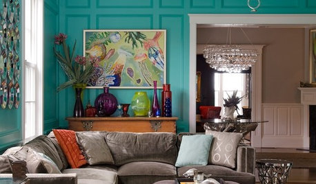
BLUE9 Beautiful Blues for Bathrooms
From soft sky to bold tropical aqua, see why this hue is making waves in bathrooms
Full Story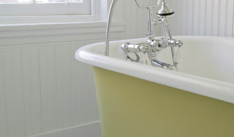
BATHROOM DESIGNRub-a-Dub-Dub, Add Color to Your Tub
Perk up that old claw-foot with a hit of paint that’s as bold or subtle as you please
Full Story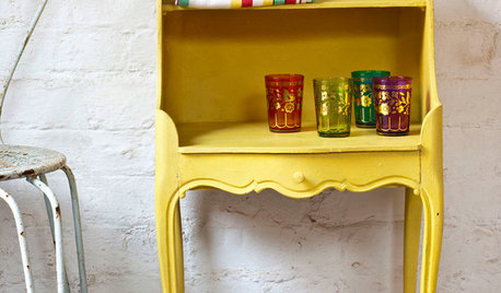
PAINTINGWhat to Know About Milk Paint and Chalk Paint — and How to Use Them
Learn the pros, cons, cost and more for these two easy-to-use paints that are great for giving furniture a vintage look
Full Story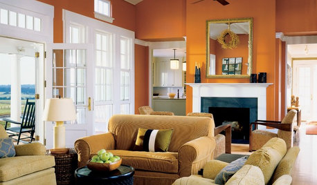
COLORDecorating 101: How to Choose Your Colors
Learn where to look for palette inspiration — and one commonly advised place maybe you shouldn’t
Full Story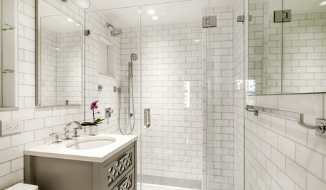
BATHROOM WORKBOOK5 Ways With a 5-by-8-Foot Bathroom
Look to these bathroom makeovers to learn about budgets, special features, splurges, bargains and more
Full Story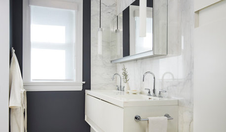
COLORBathed in Color: When to Use Black in the Bath
Dare to bring black in for a dramatic and elegant bath that's different from all the rest
Full Story
MOST POPULAR8 Great Kitchen Cabinet Color Palettes
Make your kitchen uniquely yours with painted cabinetry. Here's how (and what) to paint them
Full Story
WHITEHow to Pick the Right White Paint
White is white, right? Not quite. See 8 white paint picks for 8 very different effects
Full StoryMore Discussions

williamsem
ikea_gw
Related Professionals
Schaumburg Kitchen & Bathroom Designers · Bloomingdale Kitchen & Bathroom Remodelers · Chester Kitchen & Bathroom Remodelers · Park Ridge Kitchen & Bathroom Remodelers · Sioux Falls Kitchen & Bathroom Remodelers · Lawndale Kitchen & Bathroom Remodelers · Menlo Park Glass & Shower Door Dealers · Novato Glass & Shower Door Dealers · Springville Glass & Shower Door Dealers · Wadsworth Cabinets & Cabinetry · Whitehall Cabinets & Cabinetry · Whitney Cabinets & Cabinetry · Huntington Beach Window Treatments · Rolling Meadows Window Treatments · Taylor Window Treatmentsenduring
piscesgirlOriginal Author
piscesgirlOriginal Author
sloyder
motherof3inct
enduring
piscesgirlOriginal Author
enduring