


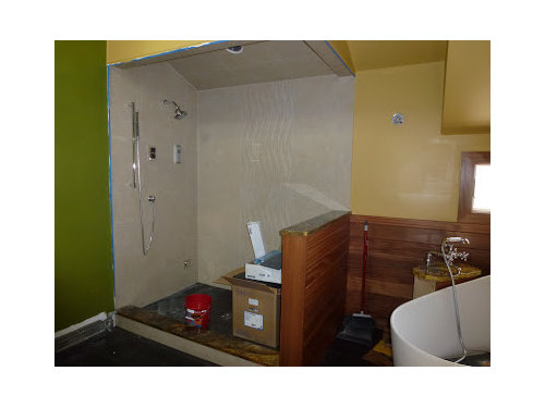
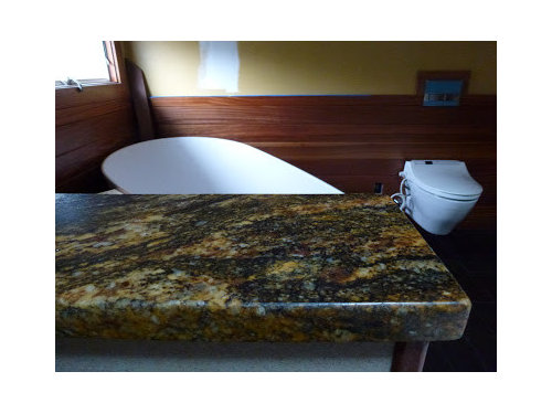
Green & Gold: Can We Be so Bold?
kashmi
12 years ago


Related Stories
COLORGo Bold With Gold
This classic color is on trend again in new, unexpected ways. See how it can make your rooms glow
Full Story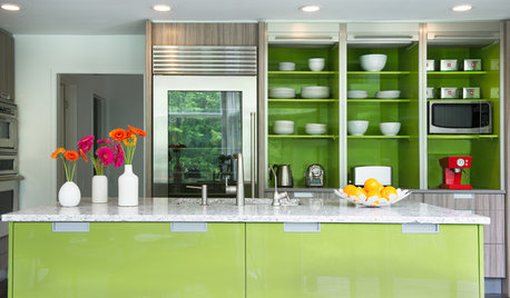
KITCHEN DESIGNKitchen of the Week: Bold Green and User Friendly in Connecticut
A renovation creates a more colorful kitchen with better traffic flow and lots of storage
Full Story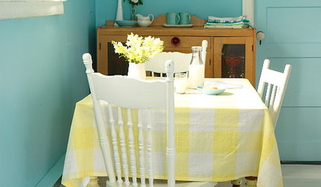
BOLD COLORBold Color: Yes You Can!
Get ideas for lots of vibrant color around the house from 5 fearless designers and homeowners
Full Story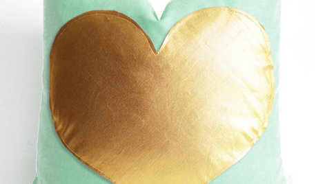
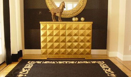
PRODUCT PICKSGuest Picks: Have a Shiny, Happy Spring With Green and Gold
Get a glimmer in your eye as the season turns, thanks to accessories and furnishings in mint to emerald with a dash of gold
Full Story
DECORATING GUIDESNo Neutral Ground? Why the Color Camps Are So Opinionated
Can't we all just get along when it comes to color versus neutrals?
Full Story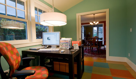
DECORATING GUIDESGo Bold (and Green) with Eco-Friendly Carpet Tiles
Get Ideas For Your Own Recyclable Rug Made of Colorful Carpet Squares
Full Story
BATHROOM DESIGN8 Bold Paint Colors for Your Powder Room
Turn your powder room into a exclamation point with a bold shot of red, raspberry, hyacinth, rich brown or stormy blue
Full Story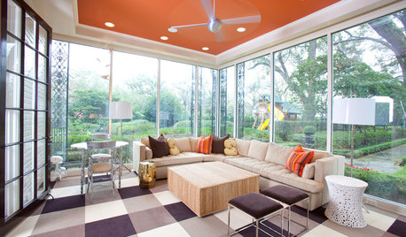
MOST POPULARHeads-Up Hues: 10 Bold Ceiling Colors
Visually raise or lower a ceiling, or just add an eyeful of interest, with paint from splashy to soothing
Full Story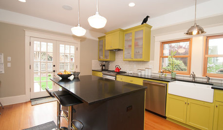
KITCHEN DESIGNKitchen of the Week: What a Difference Paint Can Make
A bold move gives a generic Portland kitchen personality without a major overhaul
Full Story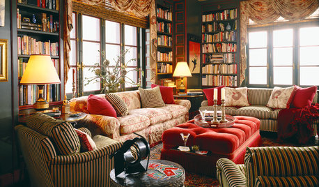
PATTERNGo for the Bold: 14 Great Ideas for Patterned Upholstery
Dare to distance yourself from neutral, solid furniture fabrics for rooms that spring to life
Full StoryMore Discussions
MongoCT
kashmiOriginal Author
Related Professionals
Freehold Kitchen & Bathroom Designers · Montebello Kitchen & Bathroom Designers · Piedmont Kitchen & Bathroom Designers · Wesley Chapel Kitchen & Bathroom Designers · Eagle Mountain Kitchen & Bathroom Remodelers · Cocoa Beach Kitchen & Bathroom Remodelers · Rolling Hills Estates Kitchen & Bathroom Remodelers · Roselle Kitchen & Bathroom Remodelers · Weston Kitchen & Bathroom Remodelers · Westminster Kitchen & Bathroom Remodelers · Sharonville Kitchen & Bathroom Remodelers · Kendall Glass & Shower Door Dealers · Miami Glass & Shower Door Dealers · Springville Glass & Shower Door Dealers · Oklahoma City Window TreatmentsGreenDesigns
kashmiOriginal Author
Lynne Reno
treasuretheday
kashmiOriginal Author
mic111
kashmiOriginal Author
treasuretheday
mic111
sochi
kashmiOriginal Author