


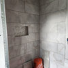
Opinions Please on Wainscot & Paint Plan in Small Full Bath
enduring
12 years ago
Featured Answer
Comments (15)

cloudbase
12 years agocloudbase
12 years agoRelated Professionals
Fresno Kitchen & Bathroom Designers · Highland Kitchen & Bathroom Designers · Hybla Valley Kitchen & Bathroom Designers · Wood River Kitchen & Bathroom Remodelers · Minnetonka Mills Kitchen & Bathroom Remodelers · Allouez Kitchen & Bathroom Remodelers · Oceanside Kitchen & Bathroom Remodelers · Southampton Kitchen & Bathroom Remodelers · Sun Valley Kitchen & Bathroom Remodelers · Lawndale Kitchen & Bathroom Remodelers · Fairmont Kitchen & Bathroom Remodelers · Norfolk Cabinets & Cabinetry · Riverbank Cabinets & Cabinetry · Short Hills Cabinets & Cabinetry · Rockford Window Treatmentscatbuilder
12 years agodekeoboe
12 years ago
enduring
12 years agosweeby
12 years agokitchenkrazed09
12 years agoenduring
12 years agosweeby
12 years agoenduring
12 years agochgojudyinaz
11 years agoenduring
11 years agoequest17
11 years agoenduring
11 years ago

Related Stories

DECORATING GUIDESNo Neutral Ground? Why the Color Camps Are So Opinionated
Can't we all just get along when it comes to color versus neutrals?
Full Story
BATHROOM DESIGNUpload of the Day: A Mini Fridge in the Master Bathroom? Yes, Please!
Talk about convenience. Better yet, get it yourself after being inspired by this Texas bath
Full Story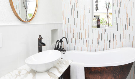
BATHROOM MAKEOVERSRoom of the Day: Superstar Style for a Small Full Bathroom
Warm metals, a claw-foot tub, repurposed outdoor faucets and a special sink base contribute to this stellar renovation
Full Story
DECORATING GUIDESHow to Use Full-Scale Decor to Make a Small Space Feel Bigger
With a less-is-more approach, even oversize furnishings can help a compact area seem roomier
Full Story
SMALL HOMESCan You Live a Full Life in 220 Square Feet?
Adjusting mind-sets along with furniture may be the key to happiness for tiny-home dwellers
Full Story
LIVING ROOMSLay Out Your Living Room: Floor Plan Ideas for Rooms Small to Large
Take the guesswork — and backbreaking experimenting — out of furniture arranging with these living room layout concepts
Full Story
DECORATING GUIDESWorking With Pros: When a Design Plan Is Right for You
Don’t want full service but could use some direction on room layout, furnishings and colors? Look to a designer for a plan
Full Story
LIFE8 Ways to Make an Extra-Full Nest Work Happily
If multiple generations or extended family shares your home, these strategies can help you keep the peace
Full Story
HOUZZ TOURSMy Houzz: Home Full of Boys Achieves Order and Inspiration
A 3-month overhaul produces an organized and inviting space fit for this Florida family of 9
Full Story
KITCHEN DESIGN15 Creative Backsplashes Full of Character
You’ll find personality aplenty in these distinctive backsplashes — and lots of inspiration too
Full StoryMore Discussions


sweeby