


Can I see photos of your two vanities?
redroze
15 years ago
Related Stories
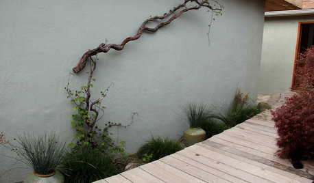
DECORATING GUIDESSee How Wabi-Sabi Can Bring Harmony and Beauty to Your Home
Create your own wabi-style style with beautifully weathered, humble materials around the house
Full Story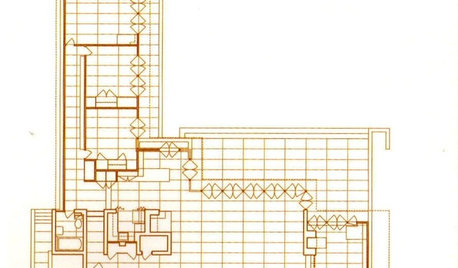
REMODELING GUIDESSee What You Can Learn From a Floor Plan
Floor plans are invaluable in designing a home, but they can leave regular homeowners flummoxed. Here's help
Full Story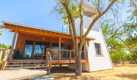
HOUZZ TOURSHouzz TV: See a Modern Family Farmhouse That Can Pick Up and Move
In the latest episode of Houzz TV, watch California architect build a beautifully practical cabin to jumpstart his parents' new farm
Full Story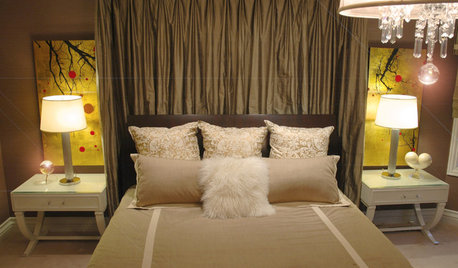
BEDROOMSBeyond Windows: See How Drapery Can Enhance Your Bed
Floor-to-ceiling fabric creates a rich backdrop for slumber
Full Story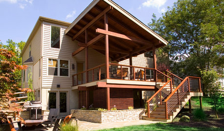
MOST POPULARSee the Difference a New Back Deck Can Make
A dramatic 2-story porch becomes the centerpiece of this Ohio family’s renovated landscape
Full Story
EVENTSNew Rug Designs You Can Expect to See Soon
This September, home professionals will gather at the New York International Carpet Show, where it’s all about floor decor
Full Story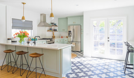
KITCHEN DESIGNTrending Now: 25 Kitchen Photos Houzzers Can’t Get Enough Of
Use the kitchens that have been added to the most ideabooks in the last few months to inspire your dream project
Full Story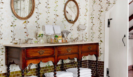
MOST POPULARYou Can Turn That Into a Bathroom Vanity?
Find inspiration in 13 unconventional bathroom vanities that are as functional as the real deal
Full Story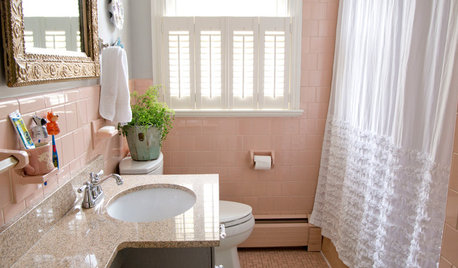
BATHROOM DESIGNHouzz Call: Have a Beautiful Small Bathroom? We Want to See It!
Corner sinks, floating vanities and tiny shelves — show us how you’ve made the most of a compact bathroom
Full Story
HOUSEPLANTSSee How Fiddleleaf Fig Trees Can Liven Up Your Decor
The tropical houseplant with big green leaves adds a cheerful and striking design element to rooms
Full StoryMore Discussions


igloochic
twosacharm
Related Professionals
Frankfort Kitchen & Bathroom Designers · Reedley Kitchen & Bathroom Designers · Camarillo Kitchen & Bathroom Remodelers · Glen Carbon Kitchen & Bathroom Remodelers · Payson Kitchen & Bathroom Remodelers · Phoenix Kitchen & Bathroom Remodelers · Tuckahoe Kitchen & Bathroom Remodelers · Tulsa Kitchen & Bathroom Remodelers · Richmond Glass & Shower Door Dealers · Saratoga Springs Glass & Shower Door Dealers · Vallejo Glass & Shower Door Dealers · Mount Prospect Cabinets & Cabinetry · Salisbury Cabinets & Cabinetry · Watauga Cabinets & Cabinetry · Orange County Window Treatmentsannkathryn
redrozeOriginal Author
ladycfp
igloochic
sapphire101
redrozeOriginal Author
igloochic
redrozeOriginal Author
Lori Billy
igloochic
redrozeOriginal Author