


deciding on a color for a Lacanche Rancge
holly6
14 years ago
Featured Answer
Comments (32)

sayde
14 years agolast modified: 9 years agoriverspots
14 years agolast modified: 9 years agoRelated Professionals
Ossining Kitchen & Bathroom Designers · Normal Kitchen & Bathroom Remodelers · Athens Kitchen & Bathroom Remodelers · Elk Grove Kitchen & Bathroom Remodelers · Honolulu Kitchen & Bathroom Remodelers · Hunters Creek Kitchen & Bathroom Remodelers · Jefferson Hills Kitchen & Bathroom Remodelers · Kendale Lakes Kitchen & Bathroom Remodelers · Tulsa Kitchen & Bathroom Remodelers · Vienna Kitchen & Bathroom Remodelers · Forest Hills Cabinets & Cabinetry · Radnor Cabinets & Cabinetry · Red Bank Cabinets & Cabinetry · Town 'n' Country Cabinets & Cabinetry · Worcester Plumbersholly6
14 years agolast modified: 9 years agoannierocks
14 years agolast modified: 9 years agoakeogh
14 years agolast modified: 9 years agokitchendetective
14 years agolast modified: 9 years agochris11895
14 years agolast modified: 9 years agowa8b
14 years agolast modified: 9 years agoholly6
14 years agolast modified: 9 years agochris11895
14 years agolast modified: 9 years agotrinkette1
14 years agolast modified: 9 years agojakkom
14 years agolast modified: 9 years agonubbyrose
14 years agolast modified: 9 years agoholly6
14 years agolast modified: 9 years agochris11895
14 years agolast modified: 9 years agotrinkette1
14 years agolast modified: 9 years agowolfgang80
14 years agolast modified: 9 years agoholly6
14 years agolast modified: 9 years agochris11895
14 years agolast modified: 9 years agotrinkette1
14 years agolast modified: 9 years agochris11895
14 years agolast modified: 9 years agoholly6
14 years agolast modified: 9 years agobarthelemy
14 years agolast modified: 9 years agokitchendetective
14 years agolast modified: 9 years agoholly6
14 years agolast modified: 9 years agoigloochic
14 years agolast modified: 9 years agokitchendetective
14 years agolast modified: 9 years agohawesnnapa_aol_com
12 years agolast modified: 9 years agochris11895
11 years agolast modified: 9 years agofinestra
11 years agolast modified: 9 years agoAnnemarie Masson
2 years ago
Related Stories
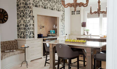
KITCHEN DESIGNKitchen of the Week: Updated French Country Style Centered on a Stove
What to do when you've got a beautiful Lacanche range? Make it the star of your kitchen renovation, for starters
Full Story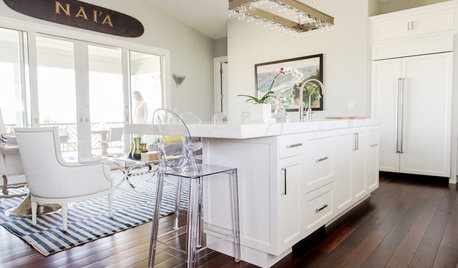
TROPICAL STYLEMy Houzz: New York Chic and Laid-Back Hawaiian Style on Maui
A relocating New Yorker designs an island home influenced by her former city life
Full Story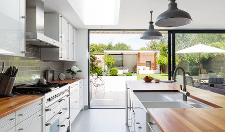
KITCHEN DESIGNA Designer Shares Her Kitchen-Remodel Wish List
As part of a whole-house renovation, she’s making her dream list of kitchen amenities. What are your must-have features?
Full Story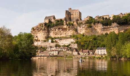
HOUZZ TOURSHouzz Tour: Bright, Rustic Cottage in France
A quaint medieval cottage in the picturesque Dordogne Valley offers historical charm and modern comforts
Full Story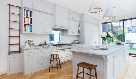
KITCHEN DESIGNKitchen of the Week: Traditional Shaker Kitchen in a London Townhouse
Personalized features, solid oak cabinet frames and a custom ladder system make for an elegant and highly efficient space
Full Story
KITCHEN DESIGNHow to Find the Right Range for Your Kitchen
Range style is mostly a matter of personal taste. This full course of possibilities can help you find the right appliance to match yours
Full Story
KITCHEN DESIGNA Cook’s 6 Tips for Buying Kitchen Appliances
An avid home chef answers tricky questions about choosing the right oven, stovetop, vent hood and more
Full Story
KITCHEN DESIGNSo Over Stainless in the Kitchen? 14 Reasons to Give In to Color
Colorful kitchen appliances are popular again, and now you've got more choices than ever. Which would you choose?
Full Story
KITCHEN DESIGNLove to Cook? We Want to See Your Kitchen
Houzz Call: Show us a photo of your great home kitchen and tell us how you’ve made it work for you
Full Story
KITCHEN DESIGNThe 4 Things Home Buyers Really Want in Kitchen Cabinetry
For the biggest return on your kitchen investment, you've got to know these key ingredients for cabinetry with wide appeal
Full StoryMore Discussions

trinkette1